Customizing Checkout+
In this article, we’ll walk through how to customise the Primary and Secondary Checkout+ buttons so they align with your store’s visual style.
Here is a breakdown of the buttons' functions:
Primary Button - selected when customers opt in to Checkout+
Secondary Button - selected when customers checks out their orders without Checkout+
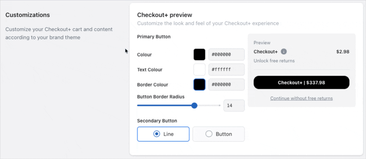
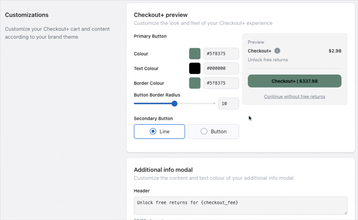
Primary Button
Under the Customizations section, you can adjust the Primary Button’s colour, corner radius, outline, and text colour.
Secondary Button
For the Secondary Button, you can choose to display it either as a simple text link or as a button.
If displayed as a button, additional options become available, allowing you to customize its spacing from the Primary Button, as well as its colour, outline, and text colour.
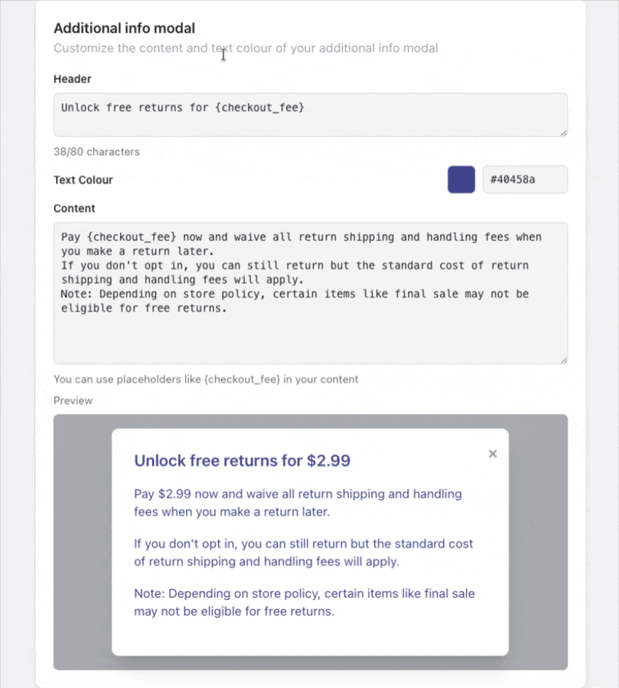
Additional Info Modal
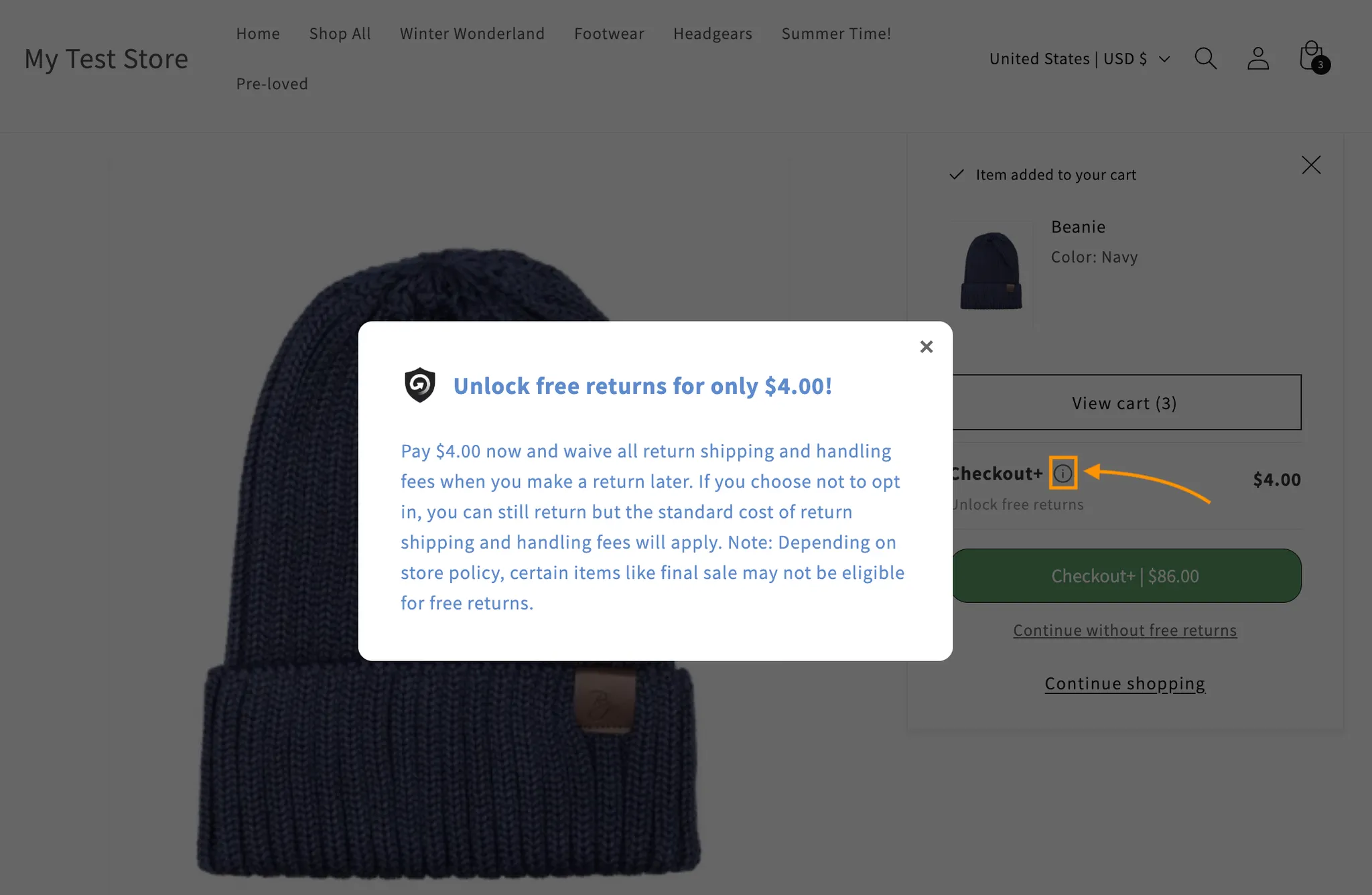
When customers are viewing their basket before checkout, customers will see the option to opt in to Checkout+ on their order. They can click the info icon to learn more, which opens a pop-up explaining the benefits and fees.
The content of this pop-up can be customised under the Additional Info Modal section. This includes the header, description text, and text colour to match your brand’s tone and style.